You Don’t Have to Keep Up With Everything — Science of Us

You Don’t Have to Keep Up With Everything — Science of Us

“It’s like a different flavor of FOMO … It’s fear of missing out, but missing out on content — and on knowledge. With limited time and mental resources, there’s no way to get through it all.”

This thing has a name: infomania. Infomania was first pointed out as an issue in 1984 by the author Elizabeth Ferrarini. Email had just been invented, and Ferrarini foresaw the desire to constantly scroll through intraweb company messages and answer them now, other priorities be damned. This behavior inspired her book, aptly titled Confessions of an Infomaniac. But infomania remained an artifact of the 1980s until 2005, when Hewlett-Packard repopularized the term by sponsoring a widely criticized study describing infomania’s effects on the human psyche, claiming that it was “worse than marijuana” in its power to reduce IQ.

Again, that research was disputed and discredited; still, most of us can relate to the feeling Zomorodi and her listener describe of being trapped in an infomania loop. The thing is, we don’t quite know how to fight against infomania besides the impractical, drastic solution of tossing our phones into a toilet. Perhaps Zomorodi said it best, when she writes about reframing society’s scorn about not knowing what’s trending right now on whatever hip social-media feed is demanding our attention.

What publishers should do / Boing Boing

What publishers should do / Boing Boing

Some of you are probably familiar with TempleOS, the computer operating system designed by Terry Davis on, according to him, God’s instructions. (Rob posted about it a couple of years ago here.)

At first, I wasn’t sure what to think. I didn’t have the technical knowledge to figure out what TempleOS actually was: A real, functioning operating system along the lines of Windows or Mac OS X? Or just a strange piece of software for making your screen look like DOS crossed with Be Here Now?

Instead, what I wanted to call out was this thoughtful essay by software engineer Richard Mitton—it’s Mitton’s attempt to look at TempleOS as a work of programming, without any preconceived bias about religion or mental illness, without an angle or an axe to grind, simply as software. Gosh, is it a refreshing read in 2016:

There are many bad things to be said about TempleOS, many aspects of it that seem poorly constructed or wouldn’t work in the “real world”. I’m going to ignore them here. It’s very easy to be negative, but you will never learn anything new by doing so…

Perhaps we should instead look at TempleOS as a research operating system: what can be accomplished if you’re not locked into established thinking, backwards compatibility, and market demands.

What can we learn if we are only willing to listen?

For me, this is what publishers should do, whether they are publishing books, websites, conferences, or, well, operating systems: “Look at this. I’ll put a frame around it, because the creator cannot truly frame the work. Here is what you need to know to appreciate this. Here is how you should think about this. Consider.”

The need for this work—publishing—is more desperate than ever, and most book publishers don’t even bother to pay lip service to this essential role of their business.

Thankfully, technology makes publishers of us all, if we choose to accept the responsibility. Your blog can be your publishing house. Put together a Medium collection of your favorite essays on a subject, with commentary.

Don’t just share. Frame your selection. Offer rich, well-researched context. Stand over my shoulder and point out where I should direct my attention, what opinions and attitudes I should consider. Call out my preconceived notions. Challenge me to really look, really think, really learn, and judge for myself.

Today, I challenge you to go beyond the retweet. Find work—a notion, an argument, a story, a work of art—that excites you and challenges you and that you believe deserves broader attention, and give it a frame, some context, and a little push.

Publish.

Information Overload or a Search for Meaning? – The American Interest

Information Overload or a Search for Meaning? – The American Interest

The principal response to the anxiety about Information Overload has been a technical one, namely, trying to improve the processing and management of information. But the development of new techniques of storage and retrieval of information does not relieve their users of the burden of interpreting it and understanding what it means. To gain meaning is a cultural accomplishment, not technical one. Unfortunately, Western society has become estranged from the messy business of engaging with meaning. This sensibility is vividly captured by the oft-repeated idiom (‘That’s too much information!”), so common that it’s now often communicated in texting simply by thumbing out “TMI.” This idiom is often used playfully to warn about “over-sharing” personal details or inappropriate sentiments. But the very fact that the ambiguities of everyday encounters are expressed through a language that quantifies personal communication (“too much”) and reduces it to abstract information speaks to a culture that all too readily assigns people the role of passive victims of information overload.

The corollary of Information Overload is the phenomenon of what Nico Macdonald, a British writer on digital culture, has characterised as Paradigm Underload. Macdonald notes that the problem facing society is not the quantity of information but the conceptual tools and paradigms with which to “filter, prioritise, structure and make sense of information.” Unfortunately, without a paradigm, the meaning of human experience becomes elusive to the point that the worship of Big Data displaces the quest for Big Ideas.


12 | The Year’s Boldest Ideas In User Interface Design | Co.Design | business + design

12 | The Year’s Boldest Ideas In User Interface Design | Co.Design | business + design

When design historians look back on 2015, they will likely point out two major trends.

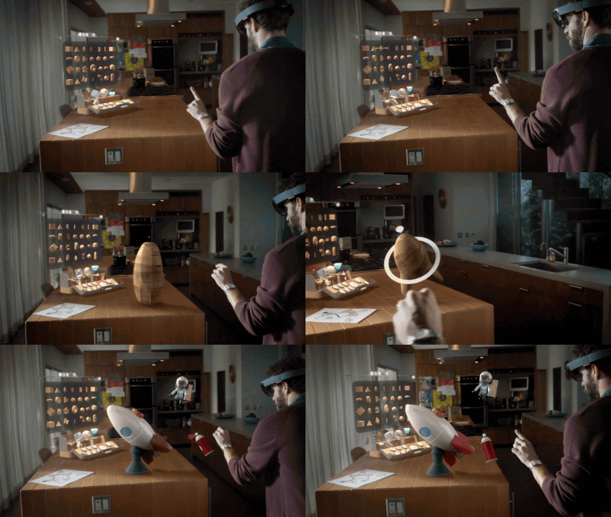
The first? The UIs of 2015 effortlessly stride between cyberspace and meatspace, from Microsoft’s HoloLens to MIT’s Lineform, a snakebot that can morph into any gadget you want.

The second: The rise of ambient interfaces, so-called zero UIs that can range from virtual secretaries to clothes that work like touch screens.

About Us | RIT Press

About Us | RIT Press

RIT Press is a scholarly publishing enterprise at Rochester Institute of Technology. Established in 2001 as RIT Cary Graphic Arts Press, the Press initially focused on publishing titles that documented graphic communication processes, printing history, and bookmaking. As its editorial policies have evolved, the Press has broadened its reach to include content that supports all academic disciplines offered at Rochester Institute of Technology, our host institution. These include — but are not limited to — business, computer science, applied science and technology, engineering, graphic arts, deaf studies, and liberal arts.

RIT Press is dedicated to the innovative use of new publishing technology while upholding high standards in content quality, publication design, and print/digital production.  The Press offers specialized titles for niche academic audiences,  trade editions for mass-market audiences, occasional limited editions with unique aesthetic standards.

Do You Read Differently Online and in Print?

Do You Read Differently Online and in Print?

The Internet may cause our minds to wander off, and yet a quick look at the history of books suggests that we have been wandering off all along. When we read, the eye does not progress steadily along the line of text; it alternates between saccades—little jumps—and brief stops, not unlike the movement of the mouse’s cursor across a screen of hypertext. From the invention of papyrus around 3000 B.C., until about 300 A.D., most written documents were scrolls, which had to be rolled up by one hand as they were unrolled by the other: a truly linear presentation. Since then, though, most reading has involved codices, bound books or pamphlets, a major advantage of which (at least compared to the scroll) is that you can jump around in them, from chapter to chapter (the table of contents had been around since roughly the first century B.C.); from text to marginal gloss, and, later, to footnote.

In the age of print, nonlinear reading found its most elaborate support in the “book wheel,” invented by the Italian engineer Agostino Ramelli in 1588: a “rotary reading desk” which allowed the reader to keep a great number of books at once, and to switch between them by giving the wheel a turn. The book wheel was— unfortunately!—a rarity in European libraries, but when you think about all the kinds of reading that print affords, the experience of starting a text at its beginning and reading all the way to the end, which we now associate with “deep” reading, looks less characteristic of print in general than of the novel in particular: the one kind of book in which, we feel, we might be depriving ourselves of something vital if we skipped or skimmed.

The quality of digital media poses one kind of problem for the reading brain; the quantity of information available to the wired reader poses a different and more serious problem. But it’s worth noting that readers have faced this problem before, too. Gutenberg printed his first Bible in 1455, and by 1500, some 27,000 titles had been published in Europe, in a total of around 10 million copies. The flood of printed matter created a reading public, and changed the way that people read.